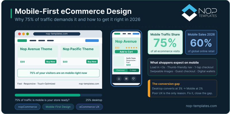
Picture this: a shopper is on their lunch break, browsing your store on their phone.
They find the perfect product. Tap "Add to Cart."
Tiny text. Misaligned fields. A checkout button buried below a wall of content.
Not because they didn't want the product, but because your mobile experience made it too hard to buy.
This isn't a rare edge case. It's happening at scale.
Today, over 75% of eCommerce traffic comes from mobile devices, especially in high-intent markets like the US, UK, and Europe.
Yet most online stores are still optimized for desktop behavior.
The result? You're paying to acquire mobile traffic… that your store isn't built to convert.
Smartphones now generate 75–78% of global eCommerce traffic.
This isn't a trend anymore, it's the default behavior.
But here's the disconnect:
While traffic is overwhelmingly mobile, conversion rates still lag behind desktop (≈2% vs 3%).
That 1% gap doesn't sound like much until you realize it represents billions in lost revenue, caused not by lack of intent, but by poor mobile experience.
Additional data reinforces the shift:
If mobile drives the majority of traffic, why does it still underperform in conversions?
The short answer: experience friction, not intent.
Mobile users are often:
When your store isn't designed for these conditions, even small usability issues compound into lost revenue.
Closing this gap is one of the highest ROI opportunities in modern eCommerce.
A responsive design adapts your desktop experience to smaller screens. A mobile-first design prioritizes the mobile experience from the start.
That difference sounds subtle, but in practice, it changes everything:
Responsive design makes your store fit mobile. Mobile-first design makes your store work on mobile.
Mobile speed isn't just a technical metric; it's a direct revenue driver. Even a 0.1-second improvement in load time can increase conversions by over 8%.
Meanwhile, more than half of users abandon sites that take longer than 3 seconds.
Every unnecessary script, oversized image, or animation delay increases friction, and on mobile, friction kills conversions fast.
Most users browse with one hand. If your key actions sit at the top corners of the screen, they're literally harder to reach.
Mobile-first design places:
Within natural thumb reach, reducing friction without changing your offer.
A fingertip isn't a mouse. Buttons smaller than 48×48 pixels lead to mis-taps, frustration, and drop-offs.
This is one of the most overlooked conversion killers in mobile UX.
On mobile, hierarchy is everything. Your product page should prioritize:
If users have to hunt for the buy button, you've already lost momentum.
Mobile checkout isn't where you collect data; it's where you remove resistance.
High-performing checkouts prioritize:
The goal isn't completeness, it's speed and completion.
Mobile users search more than they browse.
Your search bar should be :
Every extra tap between intent and result increases drop-off.
Images drive decisions, but can also kill speed.
Mobile-first design ensures:
Modern buyers switch devices constantly:
Mobile → Desktop → Mobile.
This continuity directly impacts conversions and retention.
Most nopCommerce stores aren't failing because they lack responsiveness; they're failing because the experience wasn't designed for how people actually shop on mobile.
That's the gap mobile-first themes solve.
Instead of adapting desktop layouts, they prioritize:
The result isn't just a better-looking store, it's a store that converts mobile traffic more efficiently, especially in competitive markets like the US and Europe.
Themes like Avenue, Emporium, and Pacific are specifically built around these principles.
Before investing in redesign, run this quick audit.
If you fail more than 3 of these, you're actively losing revenue.
Improving mobile UX isn't cosmetic; it's financial.
If you're investing in traffic but ignoring mobile UX, you're leaking revenue at scale.
Mobile-first isn't a competitive advantage anymore, it's the baseline.
The real question is:
Is your store converting the mobile traffic you already have?
Because if it's not, you don't have a traffic problem. You have an experience problem.
A purpose-built mobile-first nopCommerce theme can help you recover that lost revenue, without rebuilding your store from scratch.
Looking for a nopCommerce theme engineered for mobile-first performance? Browse our full collection of responsive nopCommerce themes — each one built to convert mobile shoppers, not just display correctly on their screens.
Mobile-first design means building your store for mobile devices first, then scaling up for larger screens.
Because most traffic comes from mobile, and poor mobile UX directly reduces conversions.
Responsive design adapts desktop layouts to smaller screens. Mobile-first design starts with mobile behavior and scales up.
Focus on speed, simplified checkout, thumb-friendly navigation, and digital wallets.
Yes. Google uses mobile-first indexing, so your mobile experience directly affects your search rankings.