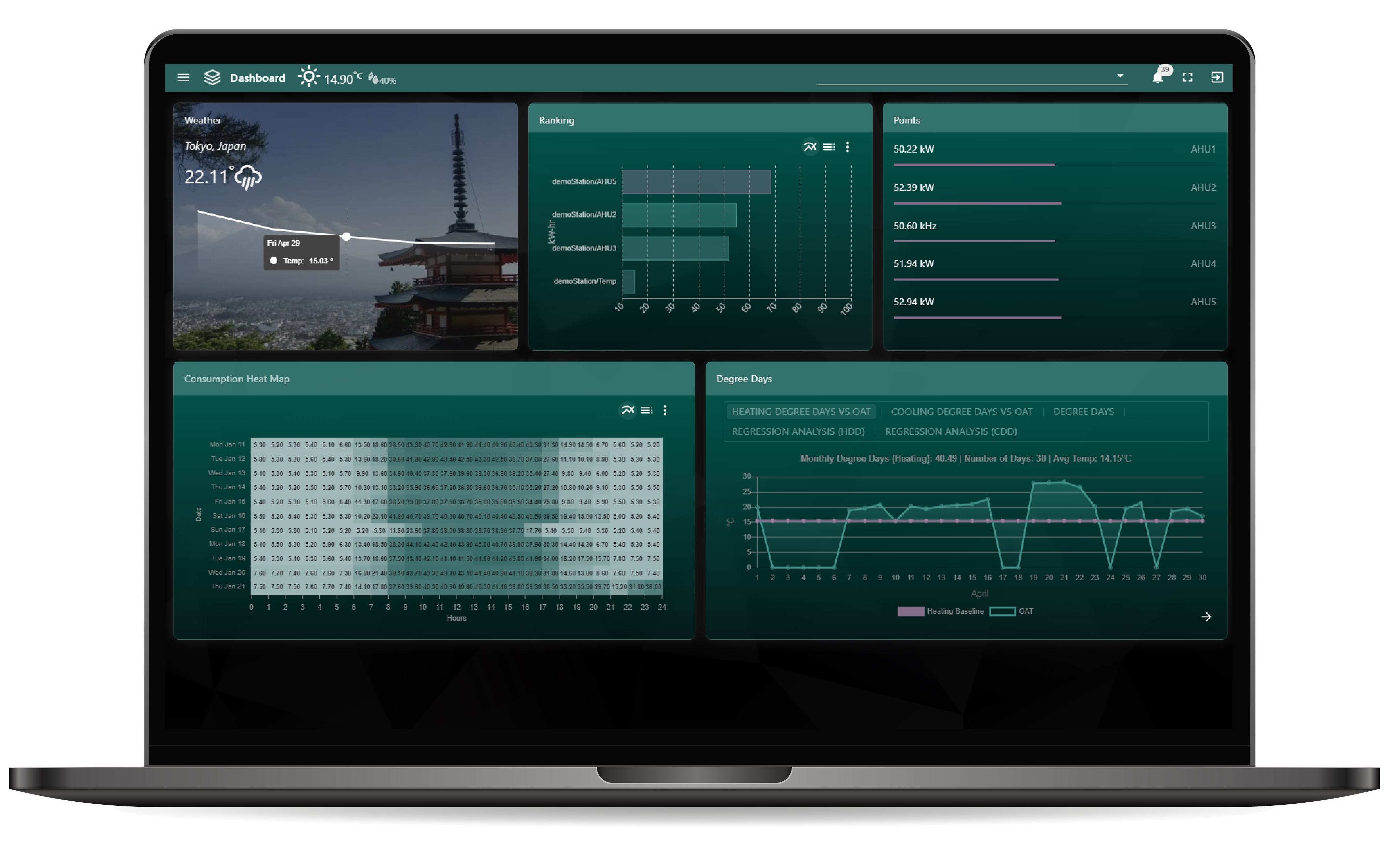
The updated N4 Consumption View shows current energy consumption, ranking, Degree Days linear regression, histories, weather, alarms, and a heat map. The template also includes PX View , Alarm View , N4 Alarms To Line Messenger , and N4 Alarms To Slack , Free Weather Service which can be used on any project. Also check out our widgets .
This view helping manage energy, analyze, and optimize the operation of facilities. It enables the user to collect and manage all major aspects of energy data and view on screen. In the settings you can adjust to show any time/value data. Set the energy benchmarks and detect low energy-efficiency areas by comparing consumptions against similar periods. Get an overview of the energy and associated costs for different zones, buildings, or time periods.
You can choose different layouts and widgets to only show what you need to show. Tabs view is included as well as role/permissions. The widgets included in the dashboard are Px View, point label, Gauge, Alarm Table, Line Chart, History Chart, Heat Map, Ranking Chart, Degree Day Regression Chart, Pie Chart, Stacked Bar Graph, Weather Location with Forecast, Free Text, Sensor Bar, and blank card.
Are you looking for a cost effective way to show energy data to your customers? Why not have a look at View Builder .
A heatmap shows consumption heat demand for a single history. It is useful for analysing different scenarios regarding the buildings and to implement energy efficiency measures for the future.
Display crucial weather data information including a 5-days forecast. Add our Free Weather Service multiple times to your station and reference each one as required.
The Ranking Chart displays the kwh assigned to a horizontal bar chart. These values are then ranked into order from highest to lowest. This could be used to rank energy usage across multiple sites, ranked to show the most efficient/inefficient.
The Degree Day Regression Analysis chart is a representation of degree days (Heating Degree Days and Cooling Degree Days) and energy consumption.
Show, filter, action alarms from specific alarm classes.
Optionally, you can show additional points and histories you may consider vital to energy consumption.
This is a yearly comparison of different systems which consume energy. It uses bql rollups and history ords to collate the data.
Compare up to 10 different point values on this pie chart. Export as csv or png.
The Counter Chart is useful for energy consumption meters which are counting up. It will find the difference between the values so you can see the consumption value. Only available in View Builder
Only in full View Builder version:
back to more dashboards...
Build Your Own dashboards and win Projects by showing data that increase value and reduces expenditure.
Home About Us Current Projects Affiliations Privacy Policy ECommerce Policy
View Builder IOT ™© Mobile Solutions N4 View Builder ™© Niagara PX Graphics
Software Development Consultancy Project Management Graphic Design Knowledge
T: +44 (0)800 511 8446 (UK) +1 888 207 4061 (US)
Copyright © 2025 Works Software & Engineering Ltd. All rights reserved.