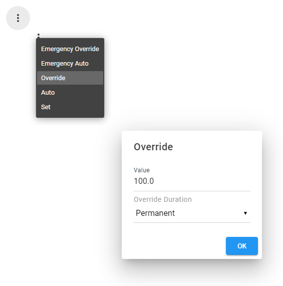
The Action Dialog Box allows you to control a numeric, string, boolean, or enum writable point. When clicking on the action icon, control point actions are displayed, e.g. Emergency Override, Emergency Auto, Override, Auto, and Set. If an input is required from the user, a dialog appears to allow the user to specify a value. More info below.
Are you looking for a cost effective way to manage and visualize data for all your customers? Why not have a look at View Builder ?
Before you start. Download the modules from our portal (see your order confirmation, which also explains licensing). Copy the modules file to your modules directory. Restart BOTH station and Workbench.
1. Copy the actionDialogBox-ux.jar file to your modules directory. 2. Open the module from your palette file. 3. Drag and drop the widget from the palette onto your px view.
The widget has a number configurable properties that can be used to modify look, feel, and functionality.
Ord Binding: Set this to an absolute ord, e.g. station:|slot:/Drivers/NiagaraNetwork/AHU5 or relativized ORD e.g. slot:AHU5 Point Types: NumericWritable, StringWritable, BooleanWritable, or EnumWritable.
Icon Svg: Button Icon in SVG format. Click here to find SVG icons.
back to more widgets...
Build Your Own dashboards and win Projects by showing data that increase value and reduces expenditure.
Home About Us Current Projects Affiliations Privacy Policy ECommerce Policy
View Builder IOT ™© Mobile Solutions N4 View Builder ™© Niagara PX Graphics
Software Development Consultancy Project Management Graphic Design Knowledge
T: +44 (0)800 511 8446 (UK) +1 888 207 4061 (US)
Copyright © 2025 Works Software & Engineering Ltd. All rights reserved.