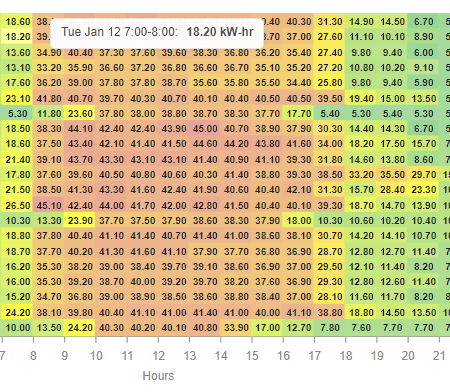
The heat map chart shows the intensity of an object. The color automatically changes based on the trend value. It can be a single color and changes its intensity accordingly. Or you can set it to multi-colour which goes from green to red or flip it to red to green. The date is on the y-axis and hours are on the x-axis. Hover over the cell to get more info for that time range. Also check out the Energy View Template .
Are you looking for a cost effective way to manage and visualize data for all your customers? Why not have a look at View Builder ?
Before you start. Download the modules from our portal (see your order confirmation, which also explains licensing). Copy the modules file to your modules directory. Restart BOTH station and Workbench.
1. Copy the heatMapchart-ux file to your modules directory. 2. Open the module from your palette file. 3. Drag and drop the widget from the palette onto your px view.
The widget has a number of configurable properties that can be used to modify look, feel, and functionality.
Changing Widget Properties - most properties are self-explanatory but some require some explaining.
Ord: Set to a history ord e.g. history:/demoStation/HeatMap
BQL: Examples: ?period=today|bql:select value,timestamp ?period=timeRange;start=2021-01-11T00:00:00.000+00:00;end=2021-01-31T23:59:59.000+00:00|bql:select value,timestamp ?period=timeRange;start=2021-01-11T00:00:00.000+00:00;end=2021-01-31T23:59:59.000+00:00 |bql:history:HistoryRollup. rollup(history:RollupInterval 'hourly')|bql:select avg,timestamp
Date Format: Examples: dddd h:mmtt d MMM yyyy = Friday 9:49am 19 Jan 2018 M/d/y = 1/19/2018 HH:mm:ss = 09:49:29 hh:mm:ss TT = 09:49:39 AM yy/M/d = 18/1/19 ddd MMM d \a\t h:mm TT = Fri Jan 19 at 9:49 AM
Max Data Value: The max data value. Choose a number just higher that the hightest data value.
Number of Color Segments: The widget will automatically create the color shades depending on the number of segements.
Reverse Multi Color: Set it to multi-colour which goes from green to red or flip it to red to green.
Set to multi or single
history:/demoStation/HeatMap?period=timeRange;start=2021-01-11T00:00:00.000+00:00;end=2021-01-31T23:59:59.000+00:00|bql:select value,timestamp
You can also add you own ranges and colours. This is in json format. Verify your json using https://jsoneditoronline.org/ The json string must be compacted, as in removing all line breaks and white space. On the link above there is an option to do this.
back to more widgets...
Build Your Own dashboards and win Projects by showing data that increase value and reduces expenditure.
Home About Us Current Projects Affiliations Privacy Policy ECommerce Policy
View Builder IOT ™© Mobile Solutions N4 View Builder ™© Niagara PX Graphics
Software Development Consultancy Project Management Graphic Design Knowledge
T: +44 (0)800 511 8446 (UK) +1 888 207 4061 (US)
Copyright © 2025 Works Software & Engineering Ltd. All rights reserved.