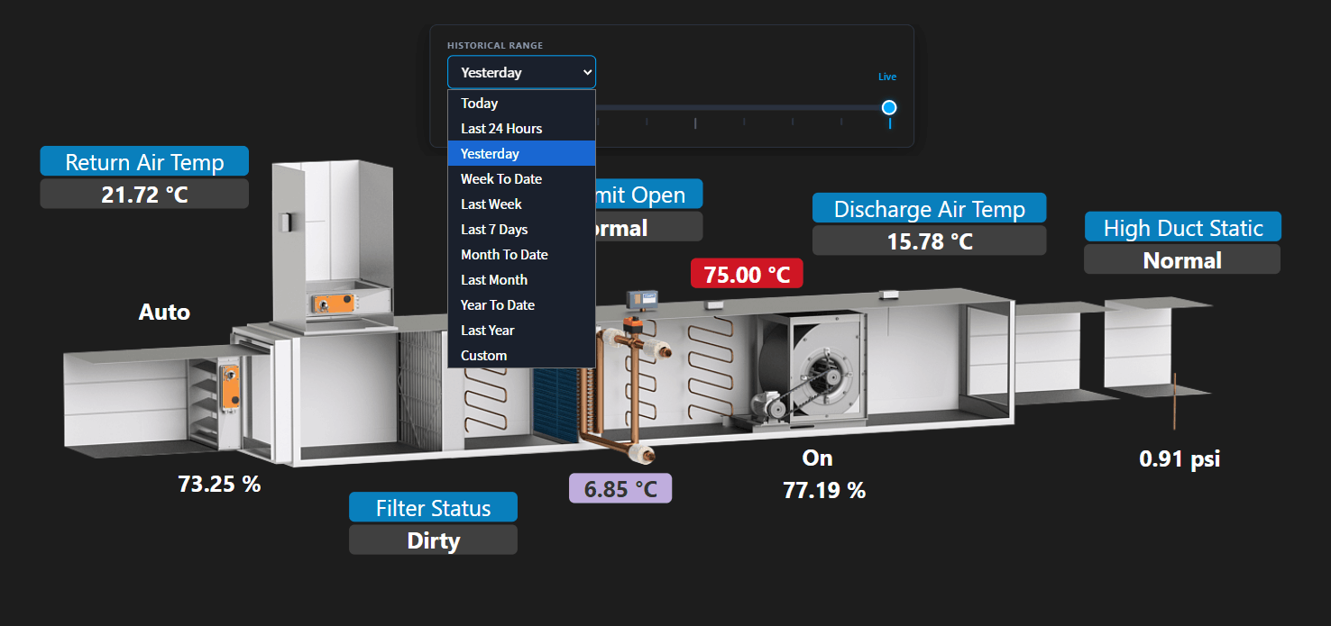
The PX graphic historical Time-Lapse Widget is an interactive dashboard component designed for Niagara px pages. It allows facility managers and engineers to "play back" historical building data - such as temperature variations, airflow, and equipment states - across a unified timeline. Instead of viewing static, isolated trend graphs, users can slide a timeline handle backward in time to see exactly how a graphic was performing at any specific moment in history. Bound labels and animated image all update by moving the easy-to-use slider. Add this to any px page which is recording histories and it will automatically go through the px file and setup the timeline slider.
Points should have a numerical interval history or change of value history. Use the time-lapse replay slider to navigate through historical data ranges (e.g. today, yesterday, week-to-date, last week, last 7 days, month-to-date, last month, year-to-date, last year, and custom). Apply a rollup to reduce the data. Use the play/pause to automate the slider for a smooth playback. Hover over the slider notches to see the time stamp.
**Note: this widget only works in browser mode. Heres is sample file to help you get started. If your PX graphic isn't working, please send it to us so we can analyze. Download
Are you looking for a cost effective way to manage and visualize data for all your customers? Why not have a look at View Builder ?
Use the standard Niagara timeframes or a custom one with roll-ups.
Before you start. Download the modules from our portal (see your order confirmation, which also explains licensing). Copy the modules file to your modules directory. Restart BOTH station and Workbench.
1. Copy the pxTimeLapseWidget-ux.jar file to your modules directory. 2. Open the module from your palette file. 3. Drag and drop the widget from the palette onto your px view.
Drag a Px Time Lapse widget from the palette to the PX Page. Your px graphic values should have bound label bindings (value bindings are not recommended). You do not need to do anything else. Note this widget only works in browser. By default today's histories are selected if there any. The slider auto populates the notches, start, and end times. 15-minute interval histories are recommended (any thing less and there will be too many notches on the timeline) Use a roll up when selecting a long date range. Roll ups are as follows: today: raw data (1 min/15min etc) yesterday: raw data (1 min/15min etc) week-to-date, last week, last 7 days : hourly month-to-date, last month: daily year-to-date, last year: monthly custom: here you can choose the time range and rollup as needed
Date Format Examples:
change some of the styling on screen, set this property e.g. Set slider colours: .bms-timeline-panel { background: #1d1d1d; } .notch-line.is-live { background: #00a8ff !important; }
to hide the hover over mini history chart: #sparklineHoverPopover { visibility: collapse; }
to disable clicking on labels: .ux-BoundLabel {pointer-events: none; }
back to more widgets...
Build Your Own dashboards and win Projects by showing data that increase value and reduces expenditure.
Home About Us Current Projects Affiliations Privacy Policy ECommerce Policy
View Builder IOT ™© Mobile Solutions N4 View Builder ™© Niagara PX Graphics
Software Development Consultancy Project Management Graphic Design Knowledge
T: +44 (0)800 511 8446 (UK) +1 888 207 4061 (US)
Copyright © 2026 Works Software & Engineering Ltd. All rights reserved.