You can adjust the settings of your widget so it can look different on desktop, tablet, and mobile devices. You do not need to create a separate widget for mobile devices. It is possible with a single instance of an Instagram widget.
If you have an upgraded widget, please visit your edit widget page. If you don’t know how to do that, please read the following article – How to change settings of my widget? If you don’t have any premium add-on, or you are just starting, please create a new Instagram widget .
Let’s say that you want to create a widget with the following settings:
Given settings are applied based on the widget width. If the widget width is between:
When you create a new widget or edit the existing one, you will always start with the desktop preview and desktop settings. The highlighted device icon above your widget preview indicates this.
According to our assumptions, we need a grid with a single row and six columns and the hover effect when the user views our widget from a desktop device.
Open the Layout section on the left side to configure the basic widget layout. The desktop icon next to the Layout label indicates that you are configuring your widget for desktop devices.
Set the Post layout to Grid , and use the slider or the input field to set the Number of columns to 6 and the Number of photos to 12 to get two rows of images.
We also want to have a hover effect on desktop devices. Open the Posts section, and in the Post hover effect , select one of the available hover effects, for instance, the Instagram icon .
All your settings for the desktop device are automatically copied to tablet and mobile environments if you did not modify them. The copy goes only downwards – from desktop to tablet and mobile, from tablet to mobile, never up. It means that changing the settings for a mobile device will not affect the configuration of the tablet or desktop.
Click the middle button with the Tablet icon in the device selector above your widget preview.
All the icons next to the section names will also change to tablet, indicating that you are changing tablet settings. Sections without device icons are globally adjusted and can’t be changed based on the device.
The assumptions for tablet devices are two rows and three columns but without the hover effect. Let’s start with the hover effect since, most probably, the Posts section is still open. Select None to turn off the hover effect
Open the Layout section and adjust the settings to show two rows and three columns. Set the Number of columns to 3 and make sure that the Number of photos is 6 .
Try to switch between Desktop and Tablet devices using the device selection above your widget preview to see how to widget changes.
It is time to configure the widget for mobile devices. Using the device selector above your widget preview, click the last button with the Mobile icon.
The assumption for mobile devices was a single-column slideshow without any hover effect. We don’t need to change the hover effect. The widget creator copied all the settings from tablet devices to mobile devices.
Open the Layout section. Change the Post layout value from Grid to Slider and update the Number of columns to 1 .
You can switch between the different devices to see if the widget shows the proper settings.
Lastly, we need to adjust when the settings are applied. We assumed those tablet settings should be loaded when the widget width is lower or equal to 960 pixels and mobile when the widget width is lower than 640 pixels.
Open the Advanced section. Update the Widget width for tablet settings to 960 pixels and the Widget width for mobile settings to 640 pixels.
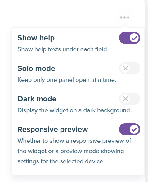
The widget preview can work in two modes:
Fixed breakpoint preview is the default mode. It shows the settings only for the given breakpoint, like a tablet, regardless of the widget’s size or the screen size. It helps to configure the widget on smaller screens properly. The downside is the lack of proper responsiveness of the plugin.
A fully responsive preview will make the preview acts like a standard, responsive widget. Still, it might be harder to configure it if your screen size is not big enough.
If you want the widget preview to behave like a feed on your website, turn on the fully responsive preview. To do so, click the button with three dots next to the device selector. A context menu will appear. Enable the Responsive preview option.